Websites have so many working parts and it’s hard to keep it all up to date. Even as our businesses grow, we need to be constantly adding to and improving our websites, whether it be with the help from a Philadelphia web development firm or via in house production! So today, I’ve compiled a list of 5 tips to making your website more user friendly! If you already have all of these things implemented, then go you!! If not, change it today so your website can be better tomorrow :) If you’re looking for different areas in where your website could improve, you may also want to look into “what is performance testing” online to see the different performance tests offered by companies, showing where your website excels and has its downfalls, making it easier to remedy any downfalls it could have.
#1 Providing a Direct Email
It’s amazing how many websites have contact forms, but no direct email in sight! I’ve heard horror stories of contact forms on the fritz and there is no other way for clients to get in contact. Also what if someone wants to reach you but the form doesn’t apply to them? For example I run into this all the time when I’m trying to send images to wedding vendors. I need their direct email to send them the gallery links and credits, but all they have is a contact form. So I have to fill it out (marking most of the boxes as N/A) and explain in the “about my wedding” box that all I need is an email. It’s SO ANNOYING! So have a direct email on your website!
#2 Featured Galleries with Images from the Same Event
It’s great to have sliding galleries of all your best work through out the years. But what clients really want to see is featured galleries with images from the same event. It’s important to show everything you provided for that one client (so that future clients can see the possibilities). This is important no matter what profession you are in. If you are a florist, post a featured gallery of your best event. Show all the bouquets, boutonnieres, centerpieces, floral arches, etc. If you are, for example, a paper products designer/calligrapher, post a gallery of all the paper products you provided to that one client or from that one event to give any future inquiries ideas of the possibilities!
#3 Do all your Links Work
Click around your entire website to make sure all your links take you to where they are suppose to. You could be losing clients because they click to your portfolio page and the link is broken. Or they want to check out your Pinterest and it takes them to the Pinterest home page instead of your business page. Check your buttons and links!
#4 Call to Actions
There’s few things worse then having a client visit your homepage and they don’t know what to do after 3 seconds of scrolling, so they just bounce right off. You need to have “Call to Actions” on every page! It’s not enough to have a menu bar at the top. People are lazy and they need direct actions telling them what to do and they are looking around. So on your Homepage, having something that says “hey come learn more about my favorite things” and provide a button that leads them to your About Me page. On your About Me page, have a button that says “enough about me, let’s talk about you and your wedding!” and link them to your portfolio page. I call it FALLING DOWN THE RABBIT HOLE.
Have you ever been on Facebook and clicked a youtube video then an hour later you are still on youtube watching videos and don’t know how you wasted that much time?!? It’s kinda like that except it’s good when people fall down the rabbit hole on your website. You want them to stay on your site as long as possible and “Call to Actions” on every page is the way to do that. Tell where to go or what to do next.
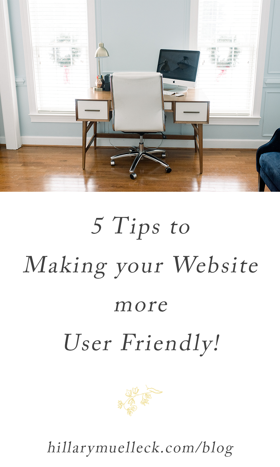
#5 Consistent Image Sizes
Of course, general image etiquette is important on your blog. Doing things like a reverse image search to find a better quality image to use on your blog is a must, otherwise, people will be put off by the low-resolution pictures that load for them. You can find out more about search reverse images here if you want to look further into it. However, one of the most important points to remember when it comes to your blogs images is to ensure they’re consistent. Large images make your website load slow and if things don’t load quickly, you’ll lose potential clients. Makes sure to resize them for the web and don’t post full resolution images. It also looks really inconsistent if the images on your blog are all different sizes. I resize all my blog images to 900px wide because my blog text length is 900px wide. I want my images to start and stop where my text starts and stops. My favorite program to use for resizing is Blogstomp. You can check it out HERE.
Hope this helps you make your website more user friendly so you can book more clients!